Showing posts with label museum. Show all posts

Wednesday, May 4, 2011

Annette Messager


"The Messengers" is Annette Messager's (obvious play on title due to her surname) 2009 exhibition at the Hayward Gallery that spans 4 years of Messager's work. Messager addresses topics such as sexuality, childhood, the body, identity, etc, in her art. She uses everyday objects in her installations such as childhood toys, photographs, and fabrics to create pretty interesting multi-media pieces. The way she sets up her installations forces viewers to look at these objects in different ways.

( from here)

I think the above piece is my favorite from "The Messengers." It focuses on body parts. They're separated, but they are still one, or a whole - and that's how it processes in my mind. I think about each image as a separate thing that makes up this great thing that is the human body, both male and female. I like how all of the images are in black and white, too. Color would have been too distracting. Some of the images are repeated in different sizes, but it does a good job of unifying the piece.

Tuesday, April 26, 2011

Installation Day!


I'm really proud of the way our Tootsie Pops display turned out! It looks really clean, fun and informative. We had the idea to use the Tootsie Pop labels as accents when we were putting it all together. We included one of every color. I think it adds a nice touch and ties things together even more. I'm glad we decided to organize the rows by color, it just adds a nice aesthetic touch. I keep telling friends at BSU to drop by the LA building and see the whole show, from what I saw today, the displays all look really great! I think I may be hopped up on sugar due to eating so many suckers, I feel the need to use a lot of exclamation points.

Thursday, April 21, 2011

Tootsie Pops

I made these before class today at work to add to our installation:


They will be Figures A, B, and C which correspond with an informational paragraph I wrote entitled "What Constitutes a Lick?" It took a few tries to get these drawings how I wanted them, but they turned out perfect. In lab we stayed an hour late finishing everything up and getting the display pretty much done for Tuesday's installment. I got to the center and it took 1,052 licks. But that's going around the orb of the sucker. If you just lick from one side, Kim and I found out it only takes about 250-350. We were reaching the center really quickly, so we altered the method of consuming the sucker to make a more pleasing display. If we would have just done one side of the sucker, the our display would only have maybe 10 suckers, despite the 3 bags (17 suckers each) that we have. Anyway, we made shelves for the Tootsie Pops, licked the Tootsie Pops, watched a silly romantic comedy, and Annelise is going to type up the title and all the information we have and we'll be ready to go on Tuesday.

Wednesday, April 20, 2011

James Luna

What I like about James Luna is his inclusion of himself as a piece of "art" in many of his displays. He feels like performance and installation are the loudest ways to make an impression, the best ways to get one's point across. And including himself in these performances/installations is crucial because what does he know better than himself? How can he speak of issues that mean a lot to him personally, without being personally involved? (summarized from an article here) As an Indian/Mexican-American, he has a lot to say about race, culture, prejudice and society.

In Artifact Piece, he places himself on display, as if it were a Natural History Museum.

(english.emory.edu)
He labeled places on his body, like a scar from "excessive drinking," etc. It really makes me question the  world of the museum. Why can't one put a live human on display? Why isn't it weird to put dead humans on display? We feel a kinship with living beings, and when they pass on it's an almost vile thing to be around their bodies. It makes me question what's important.

Sunday, April 17, 2011

Christian Boltanski

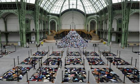
A Memorial to Nothing
(http://www.guardian.co.uk/artanddesign/2010/jan/13/christain-boltanski-grand-palais-paris)
This is Christian Boltanski's piles of clothes between large posts in front of an extra large mound of clothes. The sound of 15,000 heartbeats fill the room. What a grand statement this is. As with a lot of the art I've researched, I wish I could actually experience this in real life, rather than reading about it and seeing a small picture. I feel like I can't get the full effect. After reading a bit more about Boltanski, I found out he is a Jewish man and often makes work reminding his viewers of the genocide and human sacrifice and suffering - which adds a new layer to the meaning and background of this piece. Boltanski seems to use candles, shadows, black and white blurry photographs, and ragged clothing as a staple in many of his works. It's simple, but it's kind of eerie and dark. We've got another gloomy artist on our hands. Happiness doesn't sell, does it? I guess it is important that to understand joy, we much first understand pain; and to understand the future, sometimes we must look to the past.

Saturday, April 16, 2011

Museum Exhibit Analysis

Location 1:

WinCo. Bread Section. ~30 ft long, ~7' tall. Utilitarian context.

The wall of breads is divided by types and brands of bread. From left to right there are rolls, English Muffins, bagels, sliced breads of varying types, and buns. There is a massive selection. The packaging is uniform between brands of bread, and differs slightly between brands. The display is organized and clean. I'm overwhelmed by all the different products at first glance. It is evident thought went behind how to display the breads. It is displayed differently than all other products in the store. The sliced breads are all in slanted plastic trays in rows. Signs are placed around the breads advertising sales, and their prices are listed near them. The bread needs to be sold before a certain date, as they are perishable. In order to see the entire display, one must walk from one end to the other, as it's hard to look at all of it at once. Viewers can touch, hold and investigate breads through their transparent packaging. The meaning conveyed here is selection and ease. It's not frilly, showy, or complicated. It's easy to navigate and interpret. I think all decisions that went into making this display were based on the operations of the store and what has worked for them in other locations, and in grocery stores in general. No one questions whether the bread they are buying is bad. No one questions where it comes from, or what's in it. Price is the main concern behind preference in bread. If this display were placed almost anywhere else, the context would be different. The intended viewer is anyone who is willing to pay for bread. The installation is extremely effective for its purposes. It turns out probably hundreds of loaves a day.

Location 2:

Boise Art Museum. Stephen Knapp's Lightpaintings. Installed in the museum Oct 9, 2010 - May 17, 2010. Artistic context.

In the largest room in the Boise Art Museum, Stephen Knapp's lightpaintings cover the main wall on the right side. They are quite large. Lights are directed to colored pieces of glass, and the light scatters across the wall, sometimes onto more pieces of glass, on which they are scattered in a different direction. The colors on the wall cross and intersect with each other, making different combinations and patterns. The "paintings" created by the light are nonrepresentational. Viewers can view the entire installation at once, or approach it and look at it close up. I think Knapp is trying to make a point that light can be made into a type of sculpture. He doesn't use any backdrop except for white walls. It's all about the light and the color. The only thing Knapp seems restricted by is the size of the spaces he installs in. He took advantage of the largest wall in the museum. This could be placed in public, and I think it would still have the same effect on its viewers. The intended audience for its current setting are museum goers. I think the installation is very effective, namely because it's been extended to stay in the museum for another month, and I've already seen it three times.

Friday, April 8, 2011

Fred Wilson

We watched a PBS Art 21 video in class showcasing Fred Wilson as a guide for our next project. He is a curator of sorts, a collector, a man of many things (literally). He addresses racism in a lot of his work. What's different about Fred Wilson as an artist is that he rarely creates things with his hands - he puts things together that already exist. His work is entirely based around presentation. To put certain objects together can make very strong statements and he exploits that. By doing this, one may question not only the objects themselves, but museums in general. What is the job of a museum? Does a museum showcase (or glorify) art? artifacts? history? And how?

Drip Drop Plop

By Degree

Puppet
(all images from art21)
Fred Wilson's favorite word should be juxtaposition. Art for him isn't necessarily something "pretty" for people to look at. Art for him is his activism. He's showing the world what's wrong with it, simply by showcasing the things they've made. It's a powerful thing.