Showing posts with label art. Show all posts

Thursday, May 5, 2011

Pino

A regular customer came into my job today with some art books. I told him about what I was studying last week and he got really excited and brought me these books to look at. His favorite, and the one he wanted to talk about the most, was Pino. Pino is from Italy, and he was born in 1939. Sadly, he passed away last year. Anyway, the title of his book is "Contemporary Realism," in which he showcases beautiful oil paintings. They mostly feature women, but his touch is unique. He uses fast strokes, and his work has an impressionist feel. He puts the most detail usually within the face of the subject, and the backgrounds tend to be less detailed, and "carelessly" stroked with paint, leaving the evidence of the brush behind. I've never really been drawn to painting that much (pun intended), but looking at Pino's work makes me want to invest in some oil paints. Honestly, I don't even think I've ever seen oil paints.


I just looked this book up on Amazon, and it costs around $250. Wow. His paintings are really gorgeous, though. I'm really glad talking about art with a random customer brought me Pino.

The Last Dance
www.pino-artist.com

Waiting
www.pino-artist.com


Wednesday, May 4, 2011

Annette Messager


"The Messengers" is Annette Messager's (obvious play on title due to her surname) 2009 exhibition at the Hayward Gallery that spans 4 years of Messager's work. Messager addresses topics such as sexuality, childhood, the body, identity, etc, in her art. She uses everyday objects in her installations such as childhood toys, photographs, and fabrics to create pretty interesting multi-media pieces. The way she sets up her installations forces viewers to look at these objects in different ways.

( from here)

I think the above piece is my favorite from "The Messengers." It focuses on body parts. They're separated, but they are still one, or a whole - and that's how it processes in my mind. I think about each image as a separate thing that makes up this great thing that is the human body, both male and female. I like how all of the images are in black and white, too. Color would have been too distracting. Some of the images are repeated in different sizes, but it does a good job of unifying the piece.

Tuesday, May 3, 2011

Anne Boyles

Smoking
Kids
Engaged
I stumbled upon Anne Boyles today. She's a young artist in Boise, Idaho, and I'm about 85% positive I went to high school with her.  But anyway, she's 23 and she studied in New York for awhile, but now she's back and she's been doing these awesome photorealistic paintings. Her work can be found on anneboyles.com and all of the images are pulled from that website. 

Walkens Welcome
Marilyn Monroe

I've always been envious of those who are skilled with a brush, and I've also had a fascination with photorealism. What I love about Anne's work is that I'm really not convinced they are paintings just by looking at the images of them, because they seriously look like photographs. I'd like to see them in real life! The one of the girl smoking really intrigues me. She has a nice touch with a paintbrush.

Tuesday, April 26, 2011

Installation Day!


I'm really proud of the way our Tootsie Pops display turned out! It looks really clean, fun and informative. We had the idea to use the Tootsie Pop labels as accents when we were putting it all together. We included one of every color. I think it adds a nice touch and ties things together even more. I'm glad we decided to organize the rows by color, it just adds a nice aesthetic touch. I keep telling friends at BSU to drop by the LA building and see the whole show, from what I saw today, the displays all look really great! I think I may be hopped up on sugar due to eating so many suckers, I feel the need to use a lot of exclamation points.

Friday, April 22, 2011

Perceptions of Color: Finished


There are some subtle differences between these pictures because I thought I was done after the first one, but my teacher thought differently. Ha, it always feels like it's never really over when I'm drawing. Even with drawings I've supposedly "finished," I wouldn't feel bad about going back and revising. Anyway. Onto the final product, ta-da! It's not something I would hang in my house, it's just not my choice subject matter, but I'm proud of what I have accomplished and what I've learned about drawing in color. The most complicated parts of this drawing were the most rewarding and after weeks and weeks I'm glad to be done with it.

Thursday, April 21, 2011

Tootsie Pops

I made these before class today at work to add to our installation:


They will be Figures A, B, and C which correspond with an informational paragraph I wrote entitled "What Constitutes a Lick?" It took a few tries to get these drawings how I wanted them, but they turned out perfect. In lab we stayed an hour late finishing everything up and getting the display pretty much done for Tuesday's installment. I got to the center and it took 1,052 licks. But that's going around the orb of the sucker. If you just lick from one side, Kim and I found out it only takes about 250-350. We were reaching the center really quickly, so we altered the method of consuming the sucker to make a more pleasing display. If we would have just done one side of the sucker, the our display would only have maybe 10 suckers, despite the 3 bags (17 suckers each) that we have. Anyway, we made shelves for the Tootsie Pops, licked the Tootsie Pops, watched a silly romantic comedy, and Annelise is going to type up the title and all the information we have and we'll be ready to go on Tuesday.

Wednesday, April 20, 2011

James Luna

What I like about James Luna is his inclusion of himself as a piece of "art" in many of his displays. He feels like performance and installation are the loudest ways to make an impression, the best ways to get one's point across. And including himself in these performances/installations is crucial because what does he know better than himself? How can he speak of issues that mean a lot to him personally, without being personally involved? (summarized from an article here) As an Indian/Mexican-American, he has a lot to say about race, culture, prejudice and society.

In Artifact Piece, he places himself on display, as if it were a Natural History Museum.

(english.emory.edu)
He labeled places on his body, like a scar from "excessive drinking," etc. It really makes me question the  world of the museum. Why can't one put a live human on display? Why isn't it weird to put dead humans on display? We feel a kinship with living beings, and when they pass on it's an almost vile thing to be around their bodies. It makes me question what's important.

Sunday, April 17, 2011

Christian Boltanski

A Memorial to Nothing
(http://www.guardian.co.uk/artanddesign/2010/jan/13/christain-boltanski-grand-palais-paris)
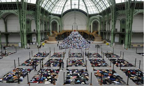
This is Christian Boltanski's piles of clothes between large posts in front of an extra large mound of clothes. The sound of 15,000 heartbeats fill the room. What a grand statement this is. As with a lot of the art I've researched, I wish I could actually experience this in real life, rather than reading about it and seeing a small picture. I feel like I can't get the full effect. After reading a bit more about Boltanski, I found out he is a Jewish man and often makes work reminding his viewers of the genocide and human sacrifice and suffering - which adds a new layer to the meaning and background of this piece. Boltanski seems to use candles, shadows, black and white blurry photographs, and ragged clothing as a staple in many of his works. It's simple, but it's kind of eerie and dark. We've got another gloomy artist on our hands. Happiness doesn't sell, does it? I guess it is important that to understand joy, we much first understand pain; and to understand the future, sometimes we must look to the past.

Saturday, April 16, 2011

Museum Exhibit Analysis

Location 1:

WinCo. Bread Section. ~30 ft long, ~7' tall. Utilitarian context.

The wall of breads is divided by types and brands of bread. From left to right there are rolls, English Muffins, bagels, sliced breads of varying types, and buns. There is a massive selection. The packaging is uniform between brands of bread, and differs slightly between brands. The display is organized and clean. I'm overwhelmed by all the different products at first glance. It is evident thought went behind how to display the breads. It is displayed differently than all other products in the store. The sliced breads are all in slanted plastic trays in rows. Signs are placed around the breads advertising sales, and their prices are listed near them. The bread needs to be sold before a certain date, as they are perishable. In order to see the entire display, one must walk from one end to the other, as it's hard to look at all of it at once. Viewers can touch, hold and investigate breads through their transparent packaging. The meaning conveyed here is selection and ease. It's not frilly, showy, or complicated. It's easy to navigate and interpret. I think all decisions that went into making this display were based on the operations of the store and what has worked for them in other locations, and in grocery stores in general. No one questions whether the bread they are buying is bad. No one questions where it comes from, or what's in it. Price is the main concern behind preference in bread. If this display were placed almost anywhere else, the context would be different. The intended viewer is anyone who is willing to pay for bread. The installation is extremely effective for its purposes. It turns out probably hundreds of loaves a day.

Location 2:

Boise Art Museum. Stephen Knapp's Lightpaintings. Installed in the museum Oct 9, 2010 - May 17, 2010. Artistic context.

In the largest room in the Boise Art Museum, Stephen Knapp's lightpaintings cover the main wall on the right side. They are quite large. Lights are directed to colored pieces of glass, and the light scatters across the wall, sometimes onto more pieces of glass, on which they are scattered in a different direction. The colors on the wall cross and intersect with each other, making different combinations and patterns. The "paintings" created by the light are nonrepresentational. Viewers can view the entire installation at once, or approach it and look at it close up. I think Knapp is trying to make a point that light can be made into a type of sculpture. He doesn't use any backdrop except for white walls. It's all about the light and the color. The only thing Knapp seems restricted by is the size of the spaces he installs in. He took advantage of the largest wall in the museum. This could be placed in public, and I think it would still have the same effect on its viewers. The intended audience for its current setting are museum goers. I think the installation is very effective, namely because it's been extended to stay in the museum for another month, and I've already seen it three times.

Tuesday, April 12, 2011

art is giving


Drew this today on a whim for a friend's birthday. It's just dinner at a restaurant, but I still feel like I should show up with something. It's of her, and it's from a picture I had on my computer. I got nupastel allllllll over my laptop. It'll be pink for a month. I'm appreciative of keyboard covers, though. Anyway, I used the same techniques we used in my drawing class awhile ago doing the "erased head," and I added more colors to it. I think it turned out nicely. All I care about is if she likes it, though! Happy 21st birthday, Chelsea!

Sunday, April 10, 2011

Ann Hamilton

Ann Hamilton often makes large installations that take up rooms or entire buildings. She is trained as a sculptor but uses textiles, objects, sounds, etc., in her pieces. There is one piece of her's (entitled "myein") I find particularly interesting and she discusses it a bit in this Art:21 video:


What I like about this piece is not only the underlying message that Hamilton has, but I also think it would be a fantastic thing to watch a wall of language understood by touch, come alive and visible before your eyes. While I respect Ms. Hamilton and all the other artists I've studied this semester so far, I've noticed the strong desire for contemporary artists to make bold, controversial statements with art. I've broadened my definition of the word "art" vastly over the past few months, but I kind of miss "l'art pour l'art" (art for art's sake). Everyone always has to make a comment or a criticism. I want to see an artist celebrating life. In finding the problems with the world, can we also find what's right with it?

Friday, April 8, 2011

Perception of Color: Progress


Today I made some progress on my perception of color drawing. Worked a lot on the stick and filling in more of the background. I'm saving the glove and the glass of water for next week so I can tackle them both and have enough time. Looking at this picture now, I feel I need to dull down the color on that fuchsia paper. It's less "electric" in real life. I like the way I did some of the contours in the wood, but it could use some highlights and it loses its 3-dimensionality on the left side.

Fred Wilson

We watched a PBS Art 21 video in class showcasing Fred Wilson as a guide for our next project. He is a curator of sorts, a collector, a man of many things (literally). He addresses racism in a lot of his work. What's different about Fred Wilson as an artist is that he rarely creates things with his hands - he puts things together that already exist. His work is entirely based around presentation. To put certain objects together can make very strong statements and he exploits that. By doing this, one may question not only the objects themselves, but museums in general. What is the job of a museum? Does a museum showcase (or glorify) art? artifacts? history? And how?

Drip Drop Plop

By Degree

Puppet
(all images from art21)
Fred Wilson's favorite word should be juxtaposition. Art for him isn't necessarily something "pretty" for people to look at. Art for him is his activism. He's showing the world what's wrong with it, simply by showcasing the things they've made. It's a powerful thing.


Wednesday, March 23, 2011

Contour Drawing

What I love about contour drawing is how well it gets you in the artistic mood. I used to hate it, but I've found that when I take my time with it, it really switches my brain over so I'm more prepared to draw. I used to think of drawing as a relaxing thing, but it requires full attention and concentration and can be a stressful thing. However, that being said, the reward I feel once I've completed a drawing is worth the "work." Here are some contour drawings I've done this semester.

Modified/Pure Contour of Shoe
(the modified is unfinished)

Modified Contour of May

Modified Contour of Brian

Modified Contour of Myself

Modified Contour of Myself
(2nd attempt)

Tuesday, March 22, 2011

James Turrell

I watched this Ted Talks podcast after class today, which inspired me to write about James Turrell, one of the artists that appeared in Rober Hughes American Visions: Age of Anxiety. The podcast was a presentation by lighting architect Rogier Van der Heide entitled "Why Light Needs Darkness." It was a really fascinating talk (and it can be watched for free through iTunes!). The point that Van der Heide makes is that one of the only reasons we as humans appreciate light is because of the presence of darkness. Because there is a contrast, we see the beauty in light. James Turrell really hones in on light in his artwork. What really caught my eye in the video we watched in class today was the Roden Crater in Arizona. From my knowledge, it isn't open, and from the research I've done, it sounds like it's under some strict supervision. Otherwise, I'd be planning a road-trip down to AZ to sneak into the Roden Crater because it sounds like a celestial experience. He transformed this crater into a gorgeous piece of art, focusing on light and observation of our skies. It looks truly beautiful and humbling. Here are some photos (from deputy-dog.com):


I want to go so badly! Anyway, we were given some questions to answer about the artist.

How does the artist utilize material/media/found object, in an art historical context, versus a contemporary context?

What's great about this piece is that he references history in the natural human desire to question our existence by looking to the skies. We often forget to look up, to gaze at stars, to appreciate the sun in our day-to-day lives. Humans have been building massive structures to do just that for hundreds of years. Look at Machu Picchu, look at the Great Pyramids; we just want to see the universe! Obviously, James Turrell is using products that were not available in previous times, but the message he's sending is universal across the life-span of homosapiens.

How do these materials inform the meaning of the piece?

The main "material" Turrell wants his visitors to focus on is the skies, and possibly the crater itself. The structure and what it's made of is not of focus, but the light and the view of the sky is. There is no painting, there is no work, and as was stated in the film we watched in class "the artwork takes place behind the viewer's eyes," which is such a beautiful concept.

What site was chosen for the artwork?

A volcanic crater in northern Arizona near Flagstaff and the Grand Canyon. It is remote, and very difficult to find.

How does the site/place inform the meaning of the artwork?

Because it is so remote, it gives it a sense of being special and an extraordinary thing. The fact that it is in Arizona doesn't mean much, but this is the first time a volcanic crater has ever been transformed to this extent for any purpose, especially artistic. It sounds like it would be a heavenly experience to visit Roden Crater and I cannot wait to someday visit. He truly uses the form of the Earth to not only create meaning, but to intensify it. I'm really excited about this!


Monday, March 21, 2011

Soap or Spam

For our midterm we were given an assignment to create a sculpture out of soap or spam, adding nothing (including armature), and using solely the contents of the package. I thought about stepping outside my comfort zone a bit and choosing spam, but I just couldn't do it. The smell of the stuff makes me gag, let alone the texture of it. So I went with soap. I haven't done much carving or sculpting so this should be an interesting challenge for me. I Googled soap sculptures, and there's a lot out there. This was probably purposeful, but it's funny we're using Ivory soap because Ivory has a whole section on their website on soap sculpting. They give you instructions and tips! They also have some examples of soap carvings/sculptures others have done:


It's amazing the details one can achieve. I've thought a little about what I'm going to sculpt, and I think I'm going to make a gnome with mushrooms and entitle something silly like "You Don't Gnome Me." There's a contest, and the winner gets a prize. She said it was sponsored by Flying M. I won't be too concerned if I don't win, seeing as I work at a coffee shop. But I will give it my best!


Sunday, March 20, 2011

Andy Goldsworthy

Andy Goldsworthy's philosophy is on his website and in summary, the man loves nature. With every place he goes he spends a lot of time getting to know the area, the materials, and everything about his environment. What's interesting about his work is that it is perishable. It doesn't keep it's form forever, but, like he mentions in his philosophy, that's his aim. When he makes a line of stones, years later, those stones will still be in a line, but moved shifted, and often, underneath more stones - so his mark is still there, just concealed within nature. Sometimes he works with materials like snow, which, obviously, will melt away and perish quite quickly as soon as the weather changes. He constantly has to work with what the environment throws at him. Here are some examples of his work. All the images are from here.


Images meant for coffee table books, but still quite beautiful and thought-provoking, Andy Goldsworthy records his work at the peak of their existence and then leaves it at the hands of nature and, subsequently, decay.

Thursday, March 17, 2011

Completed Book Project

Today we turned in our book projects. Here are some low-quality cell phone pictures of mine:

side view

top view
What I did to create this piece: I shred up to 25-30 pages at a time into strips, then I french braided the strips together - about 4 or 5 braids per section. I ended up having to take out chunks of pages in order to make the binding not fall apart. The braiding element of it is somewhat lost, but I really like the form that it ended up taking in the end. I took the cover of the book off (it was an American Government textbook from my freshman year, it cost me about $1.50 off Amazon. Score.). Altogether, I spent about 6 hours shredding and braiding this monster. It's definitely not a book anymore. I had a friend make a comment that it was "about as useful as it was before," which made me chuckle. Some of the braids started to come undone, but I think it still has unity with the random stray strips poking out.

Other students made a variety of interesting work. A lot of people chose to manipulate "Alice in Wonderland" books, some of which turned out really well. I tended to prefer the more sculptural pieces versus books that other students created, but even then some really great work was made. So many minds created such a wide variety within the same goal. Walking around and seeing everyone else's work is always my favorite part of critique day!

Monday, March 14, 2011

Livia Marin

Broken Things

Order and Similarity II
(~8,000 plastic seals from bottles)
Untitled (unhomely)
(rubber nipples)
"Fictions of a Use I"
(lipstick)
(all images from hompages.gold.ac.uk)

I think the title of Livia Marin's more recent exhibitions is perfectly fitting for her work as a whole: "Manuf®actured: The Conspicuous Transformation of Everyday Objects." What I like about Marin's artwork versus other transformation artists is that she definitely has a woman's touch, using things like lipstick, rubber nipples and pretty ceramic pieces. All of her work is clean, and very well crafted. She's from Chile, which I found interesting as she never makes any insinuation of race. Her work could be understood across many languages. She often uses consumer goods in her work, perhaps making a comment on humans and their relationship to material goods. I read an interview on itsnicethat.com and she says that she both uses objects that she's found and objects she's created, in reference to the "Broken Things" exhibit. She created some ceramic pieces, found some ceramic pieces, used old design patterns, and created new design patterns. It's impressive how cohesive and well-crafted it is, for being a jumble of original/used elements. 


Sunday, March 13, 2011

Exit Through the Gift Shop

www.banksyfilm.com


What I thought was going to be a documentary about Banksy, was really actually a documentary about Thierry Guetta. Thierry went on a mission to document street artists and it snowballed. He ended up meeting world-famous street artist Banksy and had tapes upon tapes upon tapes of unorganized footage of street art in action, and when he put it all together...it wasn't that great. Banksy decided to take matters into his own hands and created "Exit Through the Gift Shop." Upon Googling "Exit Through the Gift Shop," Google suggested to me "exit through the gift shop hoax," which piqued my interest. While it definitely launched Thierry Guetta aka Mr. Brainwash's career, I'd never suspected it to be a hoax. Conspiracy theorists, which seems extreme in this circumstance, suggest that Guetta is just a front for Banksy, or even that he is Banksy himself. They suggest it is a "satire of the contemporary art scene" ("Is Banksy's 'Exit Through the Gift Shop' a hoax too far?"). However, I have a hard time believing it was just some joke to make a lot of money, but if that was Banksy's intention, he pulled it off really well. Banksy is notoriously sneaky. After watching the documentary, you definitely get the feeling that Banksy does not take Guetta very seriously, but he does think of him as a friend. Personally, Guetta's insta-success made me face-palm on more than one occasion, mostly because he churns out art like a machine, but doesn't seem to have the same kind of passion for it like Banksy or Shepard Fairey. If it is a hoax, if it just happens to be some ploy by Fairey and Banksy to make a statement or some PR campaign to boost their popularity and make more money, way to go them. They really thought everything through. Thierry Guetta is a weird French guy who mumbles and bumbles and he's "making" art (aka hiring graphic designers off craigslist to go through "The Art Book") that basically rips off Warhol and other artists and he's making upwards of $500,000 for pieces of his art. It's a brilliant statement about commercial art. Thierry Guetta's probably just a really skilled actor. We'll probably never know.