 |
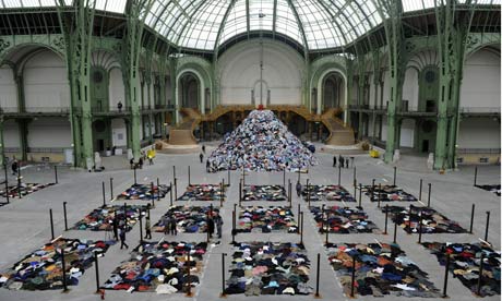
| A Memorial to Nothing (http://www.guardian.co.uk/artanddesign/2010/jan/13/christain-boltanski-grand-palais-paris) |
Sunday, April 17, 2011
Christian Boltanski

Saturday, April 16, 2011
Museum Exhibit Analysis
Location 1:
WinCo. Bread Section. ~30 ft long, ~7' tall. Utilitarian context.
The wall of breads is divided by types and brands of bread. From left to right there are rolls, English Muffins, bagels, sliced breads of varying types, and buns. There is a massive selection. The packaging is uniform between brands of bread, and differs slightly between brands. The display is organized and clean. I'm overwhelmed by all the different products at first glance. It is evident thought went behind how to display the breads. It is displayed differently than all other products in the store. The sliced breads are all in slanted plastic trays in rows. Signs are placed around the breads advertising sales, and their prices are listed near them. The bread needs to be sold before a certain date, as they are perishable. In order to see the entire display, one must walk from one end to the other, as it's hard to look at all of it at once. Viewers can touch, hold and investigate breads through their transparent packaging. The meaning conveyed here is selection and ease. It's not frilly, showy, or complicated. It's easy to navigate and interpret. I think all decisions that went into making this display were based on the operations of the store and what has worked for them in other locations, and in grocery stores in general. No one questions whether the bread they are buying is bad. No one questions where it comes from, or what's in it. Price is the main concern behind preference in bread. If this display were placed almost anywhere else, the context would be different. The intended viewer is anyone who is willing to pay for bread. The installation is extremely effective for its purposes. It turns out probably hundreds of loaves a day.
Location 2:
Boise Art Museum. Stephen Knapp's Lightpaintings. Installed in the museum Oct 9, 2010 - May 17, 2010. Artistic context.
In the largest room in the Boise Art Museum, Stephen Knapp's lightpaintings cover the main wall on the right side. They are quite large. Lights are directed to colored pieces of glass, and the light scatters across the wall, sometimes onto more pieces of glass, on which they are scattered in a different direction. The colors on the wall cross and intersect with each other, making different combinations and patterns. The "paintings" created by the light are nonrepresentational. Viewers can view the entire installation at once, or approach it and look at it close up. I think Knapp is trying to make a point that light can be made into a type of sculpture. He doesn't use any backdrop except for white walls. It's all about the light and the color. The only thing Knapp seems restricted by is the size of the spaces he installs in. He took advantage of the largest wall in the museum. This could be placed in public, and I think it would still have the same effect on its viewers. The intended audience for its current setting are museum goers. I think the installation is very effective, namely because it's been extended to stay in the museum for another month, and I've already seen it three times.
WinCo. Bread Section. ~30 ft long, ~7' tall. Utilitarian context.
The wall of breads is divided by types and brands of bread. From left to right there are rolls, English Muffins, bagels, sliced breads of varying types, and buns. There is a massive selection. The packaging is uniform between brands of bread, and differs slightly between brands. The display is organized and clean. I'm overwhelmed by all the different products at first glance. It is evident thought went behind how to display the breads. It is displayed differently than all other products in the store. The sliced breads are all in slanted plastic trays in rows. Signs are placed around the breads advertising sales, and their prices are listed near them. The bread needs to be sold before a certain date, as they are perishable. In order to see the entire display, one must walk from one end to the other, as it's hard to look at all of it at once. Viewers can touch, hold and investigate breads through their transparent packaging. The meaning conveyed here is selection and ease. It's not frilly, showy, or complicated. It's easy to navigate and interpret. I think all decisions that went into making this display were based on the operations of the store and what has worked for them in other locations, and in grocery stores in general. No one questions whether the bread they are buying is bad. No one questions where it comes from, or what's in it. Price is the main concern behind preference in bread. If this display were placed almost anywhere else, the context would be different. The intended viewer is anyone who is willing to pay for bread. The installation is extremely effective for its purposes. It turns out probably hundreds of loaves a day.
Location 2:
Boise Art Museum. Stephen Knapp's Lightpaintings. Installed in the museum Oct 9, 2010 - May 17, 2010. Artistic context.
In the largest room in the Boise Art Museum, Stephen Knapp's lightpaintings cover the main wall on the right side. They are quite large. Lights are directed to colored pieces of glass, and the light scatters across the wall, sometimes onto more pieces of glass, on which they are scattered in a different direction. The colors on the wall cross and intersect with each other, making different combinations and patterns. The "paintings" created by the light are nonrepresentational. Viewers can view the entire installation at once, or approach it and look at it close up. I think Knapp is trying to make a point that light can be made into a type of sculpture. He doesn't use any backdrop except for white walls. It's all about the light and the color. The only thing Knapp seems restricted by is the size of the spaces he installs in. He took advantage of the largest wall in the museum. This could be placed in public, and I think it would still have the same effect on its viewers. The intended audience for its current setting are museum goers. I think the installation is very effective, namely because it's been extended to stay in the museum for another month, and I've already seen it three times.
Friday, April 15, 2011
Perceptions of Color: Progress 2

Made a lot of progress on my nupastel drawing today. I was particularly worried about the glove, but I think I've done a nice job so far, especially with the cloth portion of it. I need to made the shadows a lot deeper. With the glass, I think I have kind of the same problem as I do with the glove, and that's shadow. The cast shadow of the glove could use some work as well. Also, my flower. I did it at the very beginning and now looking it over, I feel it needs touching up and definition, maybe even a different color choice. I'm really close to being done. It needs some editing, and the postcard isn't finished, but I'll be done by next Friday!
Tuesday, April 12, 2011
art is giving

Drew this today on a whim for a friend's birthday. It's just dinner at a restaurant, but I still feel like I should show up with something. It's of her, and it's from a picture I had on my computer. I got nupastel allllllll over my laptop. It'll be pink for a month. I'm appreciative of keyboard covers, though. Anyway, I used the same techniques we used in my drawing class awhile ago doing the "erased head," and I added more colors to it. I think it turned out nicely. All I care about is if she likes it, though! Happy 21st birthday, Chelsea!
Museum Project
We were given a project in class to make an exhibit. It's a really open-ended project and I had no idea what I was going to do. I didn't have a single idea I thought was good enough, or reasonable enough, to be accomplished successfully. Then in lab today we were supposed to start coming up with proposals for our projects and I partnered up with Annelise. She had an idea about putting up VHS tapes on display and attaching people's stories/memories to them. I don't know exactly how the idea came to be, but she was talking about the decay process of VHS tapes and putting them in rows and suddenly Tootsie Pops came to mind. My idea was to put them into rows of suckers of diminishing size and show how long it would take to get to the center. We played around with both ideas for awhile but ended up going with the Tootsie Pops, because we felt it was a little stronger. So I'm going to type up the concept and process and Annelise is going to tackle the list of items needed and description of the installation. I'm excited about it. I think we have solid ideas and Annelise is super organized and detail-oriented.
 |
| How Many Licks Does it Take? (tootsie.com) |
Edit (later): I finished the concept and process.
Concept: We’re out to solve the ancient mystery: how many licks does it take to get to the center of a Tootsie Pop? This age-old question is unsuccessfully answered by Mr. Owl in Tootsie Pop commercials after he gets too impatient to lick his sucker anymore. They leave us with: “the world may never know.” The display will answer this question, and show the varying stages of consumption.
Process: Group members will be assigned to lick Tootsie Pops in specific increments. The Tootsie Pops would then be placed in order of diminishing size in rows. An informational plaque will be created describing what constitutes a “lick.” In order to keep the experiment more accurate, group members will be required to consume the sucker in as close to the same way as possible.
Sunday, April 10, 2011
Ann Hamilton
Ann Hamilton often makes large installations that take up rooms or entire buildings. She is trained as a sculptor but uses textiles, objects, sounds, etc., in her pieces. There is one piece of her's (entitled "myein") I find particularly interesting and she discusses it a bit in this Art:21 video:
What I like about this piece is not only the underlying message that Hamilton has, but I also think it would be a fantastic thing to watch a wall of language understood by touch, come alive and visible before your eyes. While I respect Ms. Hamilton and all the other artists I've studied this semester so far, I've noticed the strong desire for contemporary artists to make bold, controversial statements with art. I've broadened my definition of the word "art" vastly over the past few months, but I kind of miss "l'art pour l'art" (art for art's sake). Everyone always has to make a comment or a criticism. I want to see an artist celebrating life. In finding the problems with the world, can we also find what's right with it?
Friday, April 8, 2011
Perception of Color: Progress

Today I made some progress on my perception of color drawing. Worked a lot on the stick and filling in more of the background. I'm saving the glove and the glass of water for next week so I can tackle them both and have enough time. Looking at this picture now, I feel I need to dull down the color on that fuchsia paper. It's less "electric" in real life. I like the way I did some of the contours in the wood, but it could use some highlights and it loses its 3-dimensionality on the left side.
Subscribe to:
Posts (Atom)