Saturday, March 19, 2011

More head drawings!

For this drawing assignment we had to draw to small heads with graphite. One of a classmate using light/shadow shapes, and the other of yourself using hatching.


I think my lines may be a bit too harsh in the above drawing. I could have used just a little extra time.


After we were finished with the graphite drawings, we took a piece of matte drafting film and did ink drawings of the heads. The drafting film is clear, so we just lay it over the top and tape it down and use the graphite drawings as guides. For the first head we use a wash method, and for our self-portraits we use a drawing pen and ink (with optional addition of wash, if desired).


The wash part was kind of hard to get used to because the ink would really resist the drafting film, especially the lighter tones which had more water added. The pen was really easy and fun to work with. I got a variety of line density and application. I added a wash over the top of the hatching, especially in the hair.


Thursday, March 17, 2011

Completed Book Project

Today we turned in our book projects. Here are some low-quality cell phone pictures of mine:

side view

top view
What I did to create this piece: I shred up to 25-30 pages at a time into strips, then I french braided the strips together - about 4 or 5 braids per section. I ended up having to take out chunks of pages in order to make the binding not fall apart. The braiding element of it is somewhat lost, but I really like the form that it ended up taking in the end. I took the cover of the book off (it was an American Government textbook from my freshman year, it cost me about $1.50 off Amazon. Score.). Altogether, I spent about 6 hours shredding and braiding this monster. It's definitely not a book anymore. I had a friend make a comment that it was "about as useful as it was before," which made me chuckle. Some of the braids started to come undone, but I think it still has unity with the random stray strips poking out.

Other students made a variety of interesting work. A lot of people chose to manipulate "Alice in Wonderland" books, some of which turned out really well. I tended to prefer the more sculptural pieces versus books that other students created, but even then some really great work was made. So many minds created such a wide variety within the same goal. Walking around and seeing everyone else's work is always my favorite part of critique day!

Monday, March 14, 2011

Livia Marin

Broken Things

Order and Similarity II
(~8,000 plastic seals from bottles)
Untitled (unhomely)
(rubber nipples)
"Fictions of a Use I"
(lipstick)
(all images from hompages.gold.ac.uk)

I think the title of Livia Marin's more recent exhibitions is perfectly fitting for her work as a whole: "Manuf®actured: The Conspicuous Transformation of Everyday Objects." What I like about Marin's artwork versus other transformation artists is that she definitely has a woman's touch, using things like lipstick, rubber nipples and pretty ceramic pieces. All of her work is clean, and very well crafted. She's from Chile, which I found interesting as she never makes any insinuation of race. Her work could be understood across many languages. She often uses consumer goods in her work, perhaps making a comment on humans and their relationship to material goods. I read an interview on itsnicethat.com and she says that she both uses objects that she's found and objects she's created, in reference to the "Broken Things" exhibit. She created some ceramic pieces, found some ceramic pieces, used old design patterns, and created new design patterns. It's impressive how cohesive and well-crafted it is, for being a jumble of original/used elements. 


Sunday, March 13, 2011

Exit Through the Gift Shop

www.banksyfilm.com


What I thought was going to be a documentary about Banksy, was really actually a documentary about Thierry Guetta. Thierry went on a mission to document street artists and it snowballed. He ended up meeting world-famous street artist Banksy and had tapes upon tapes upon tapes of unorganized footage of street art in action, and when he put it all together...it wasn't that great. Banksy decided to take matters into his own hands and created "Exit Through the Gift Shop." Upon Googling "Exit Through the Gift Shop," Google suggested to me "exit through the gift shop hoax," which piqued my interest. While it definitely launched Thierry Guetta aka Mr. Brainwash's career, I'd never suspected it to be a hoax. Conspiracy theorists, which seems extreme in this circumstance, suggest that Guetta is just a front for Banksy, or even that he is Banksy himself. They suggest it is a "satire of the contemporary art scene" ("Is Banksy's 'Exit Through the Gift Shop' a hoax too far?"). However, I have a hard time believing it was just some joke to make a lot of money, but if that was Banksy's intention, he pulled it off really well. Banksy is notoriously sneaky. After watching the documentary, you definitely get the feeling that Banksy does not take Guetta very seriously, but he does think of him as a friend. Personally, Guetta's insta-success made me face-palm on more than one occasion, mostly because he churns out art like a machine, but doesn't seem to have the same kind of passion for it like Banksy or Shepard Fairey. If it is a hoax, if it just happens to be some ploy by Fairey and Banksy to make a statement or some PR campaign to boost their popularity and make more money, way to go them. They really thought everything through. Thierry Guetta is a weird French guy who mumbles and bumbles and he's "making" art (aka hiring graphic designers off craigslist to go through "The Art Book") that basically rips off Warhol and other artists and he's making upwards of $500,000 for pieces of his art. It's a brilliant statement about commercial art. Thierry Guetta's probably just a really skilled actor. We'll probably never know.

Sunday, March 6, 2011

Molotov Man

 Who is the Molotov Man?
The actual man is "Pablo Araus, who was known as 'Bareta' during the war" (Meiselas 57) but what we're actually referring to when we ask that question is this man:
"Untitled"
Susan Meiselas
(from itp.nyu.edu)
"The man is throwing his bomb at a Somoza national guard garrison, one of the last such garrisons remaining in Somoza's hands. It was an important moment in the history of Nicaragua--the Sandinistas would soon take power and hold that power for another decade--and this image ended up representing that moment for a long time to come" (Meiselas 57).

He is a symbol of struggle, pain, passion and empowerment. According to artist Joy Garnett, who he is is not as important as what he represents. She did a series of paintings depicting people in extreme emotion. One of those paintings depicted the Molotov Man.

"Molotov"
Joy Garnett
(from robertlpeters.com)
Since she felt that this painting best described her series, she chose it for the postcard to represent her exhibition. This started a legal battle between Susan Meiselas and Joy Garnett. Meiselas is a strong supporter of the importance of context, especially when relating to this piece. Garnett on the other hand, completely erases context, zeroing in on one aspect of the Molotov Man, his intense emotion. "'Who owns the right to this man's struggle?'" (Garnett 55).

How did the meaning or identity of the Molotov Man change in its different representations and contexts?
In Joy Garnett's work, he has no identity. He is just a man in a rage. The power of his expression is the focus of the piece. However, Garnett wasn't the first person to reuse Meiselas's image, and she probably won't be the last. The reason why the above painting upset Meiselas is because of the lack of context. In any other use of the image before Garnett, it was still relatable to the original context. It has been used on matchbook covers to celebrate the anniversary of the revolution. Also it was used by the Nicaraguan Catholic Church because they noticed he was wearing a crucifix. They used the image on the cover of a magazine to tribute to a priest who was killed while fighting the Somoza's. In both of these instances, the Molotov Man is representing the original meaning/context fairly closely. It gets funny when stencils of the Molotov Man are spray painted in Honduras and linked with the Spanish Civil War, however, it's still about revolution. Ironically, the Contras themselves used the image to support the US in fighting the Sandinistas, and the Molotov Man himself is a Sandinista.

The context around the Molotov Man changes on its use and placement, but the focus of the image is his intense emotion. Humans can easily identify the struggle in the Molotov Man, and that is the most powerful thing about it. Does context matter? I agree that it definitely makes the piece stronger, once you know the story behind it. But the idea of ripping it out of context and focusing on one element also creates a moving work.


Thursday, March 3, 2011

Gesture Drawing

Earlier this semester, we did gesture drawings. The goal of this lesson was to learn the perception of the whole, also known as perception of the gestalt and that subject + form = content. We as humans can empathize with the way materials are applied in drawings, as they indicate the expressive quality. These drawings were done quickly, at arms length with continuous marks.

Mass Gesture and Mass & Line Gesture
The drawings above and below took about 4 minutes each. They're done on 18"x24" newsprint with vine charcoal.

Line Gesture & Scribble Line Gesture
 Of all the gesture drawings I did, I think the line gesture was my favorite.

The one below is sustained gesture and took about 13 minutes.

Sustained Gesture

Tuesday, March 1, 2011

Book Artists

Our newest project is to create a visually interesting sculpture from a book or to create an artist's book. I decided to go the sculpture route. I played around with folding the pages but just wasn't inspired by anything in particular, so at first I was frustrated with the project. I ended up shredding the pages and have since gotten some interesting results from playing around with it. The creative process sometimes proves to be very vexing.

Anyway, I did some research on book arts.

Myself as my grandfather, made of crickets, grass and rain
(image from www.judithhoffman.net)
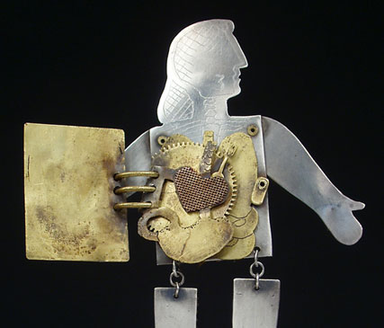
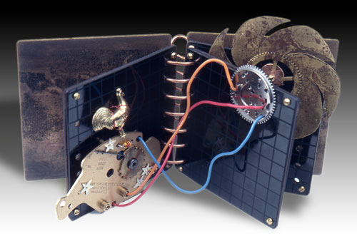
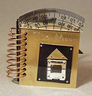
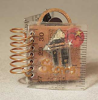
This is a work by book artist Judith Hoffman. She specializes in art metals, but also makes paper books. She has a series of books entitled "Instruction Manual for a Moon," "Instruction Manual for Stars," and "Instruction Manual for a Heart." They're really cute, which I hope isn't a demeaning term. She uses found objects and creates these little "manuals."

Instruction Manual for a Heart
(www.judithhoffman.net)

Instruction Manual for the Moon
(www.judithhoffman.net)

Instruction Manual for the Stars
(www.judithhoffman.net)
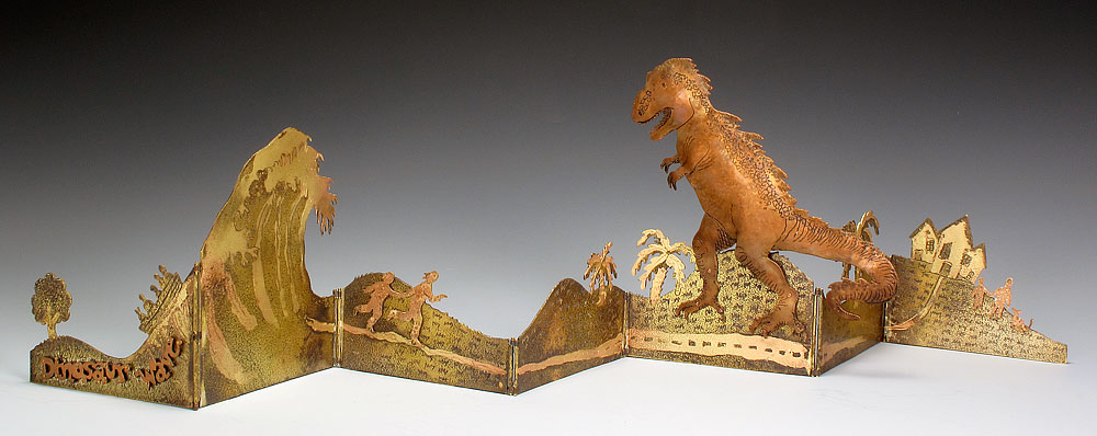
Her paper books I found aren't nearly as interesting. Her metalwork is just something I haven't ever really seen before.

Dinosaur Wave
(www.judithhoffman.net)

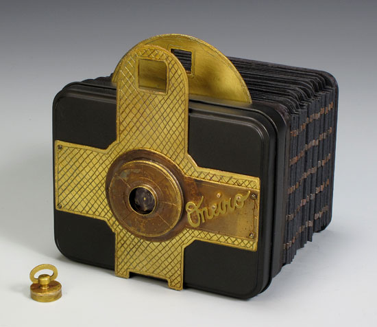
But I think this is by far her coolest work:
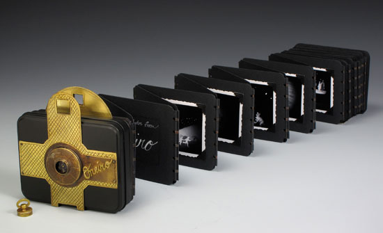
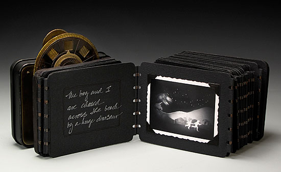
Oneiro
(www.judithhoffman.net)
It's really well crafted, and really clever, and I really wish I could look at the whole thing. Did I mention that the cover is actually a functioning pinhole camera, and the subsequent pictures are taken from said camera? Pretty sweet.

Moving on...

Shu-Ju Wang is a working artist in Portland, Oregon. She makes really interesting artists books out of objects one really wouldn't expect a book to be made from.

Cradles for Our Memories
(www.fingerstothebone.com)
Now "Cradles for Our Memories" might seem confusing at first glance. What is it? This is her description from her website: "The images are Gocco printed on tulle, a very loose mesh of netting material. When a single printed layer of tulle is viewed, the image is barely visible. But when several layers of the printed tulle are stacked and registered, the image appears." Pillows!

This is another one of her pillow books:
Random Cruelty
(www.fingerstothebone.com)
Then she does things like this:
Pocket Atlas for Travelers
(www.fingerstothebone.com)
This is an account of her journey from Taiwan to California.

Project Sushi
(www.fingerstothebone.com)
"Written as a blog, this [Project Sushi] is an account of the search for Ratwoman, superhero to some and villain to others. Like everything else you read on the web, it comes complete with hyperlinks, errors, deadends, and the content should be taken with a grain of salt" (excerpt from fingerstothebone.com).

Nigrum
(www.fingerstothebone.com)
This one is my favorite of Shu-Ju Wang's. It has three poems on one side and a map of The Banda Islands. I like that the slats can be switched around to see bits of both sides at once, or you can look at them each as a whole.


Also, slats is a great idea! It reminds me of Venetian blinds.

I couldn't find this one on Shu-Ju Wang's website, but I was actually directed there because I found this:
Martha
(www.23sandy.com)
What I like about this one is it's like book times two. Each page is like a letter, and it's interactive. It reminds me of a book series I once read called Griffin and Sabine by Nick Bantock.

(image from amazon.com)
If you haven't read it, I would recommend doing so. The books are filled with really interesting art, and with removable letters and postcards. It's about an "extraordinary correspondence" between two people, Griffin and Sabine. Fascinating, I had completely forgot about this. Let's see if Nick Bantock does any more "book art" type work...

Turns out he does, but it's not like the book artists I was looking at earlier. He makes more books like Griffin and Sabine, all including his original artwork with removable pieces. He also made an interesting pop-up book series, my favorite of which was a pop-up version of Lewis Carroll's "The Jabberwocky."

(image from amazon.com)
But he also does pop-ups of Robin Hood, The Walrus and the Carpenter, There Was an Old Lady, etc.


Wow, what a book arts journey that was. To be honest I'm kind of exhausted, but I'm forever expanding my definition of art, which I've learned is pretty much the focus of Art Foundations.

That question remains, "What makes art?"